Which CPG Protein Brand Is Actually Winning on Social in 2026?
The protein category is one of the most crowded in CPG, and the brands that are pulling ahead aren't just outspending each other on ads; they're outposting, out-engaging, and out-creating each other on Instagram and TikTok.
We decided to find out who's actually winning, not based on vibes or follower counts, but on real performance data. We put five of the biggest names in the protein space under the microscope — Fairlife, Premier Protein, Quest Nutrition, RXBar, and Built Bar — and compared their Instagram and TikTok performance head to head in 2026.
Which CPG Protein Brand Wins on Instagram?
We took our data-enthused magnifying glass and evaluated all of these brands on Instagram. The following readings were produced in addition to some data annotations:
Data Annotations:
- We collected content from each channel, specifically from 2026, with a cutoff of 3/27.
- Content labeled as paid partnerships was excluded, while organic or potentially boosted content was included.
- We only used publicly available data.
Our Analysis
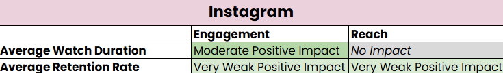
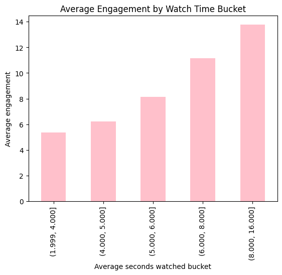
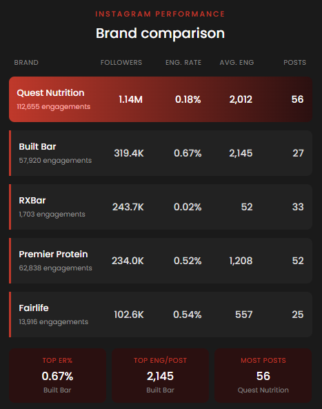
Across these five CPG protein brands on Instagram, Quest Nutrition dominates in raw scale with 1.14M followers and the highest total engagements, but their 0.18% engagement rate reveals that most of that massive audience isn't actively interacting.
Built Bar punches well above its weight — despite having the fewest posts (27) and a mid-tier following, they lead in engagement rate (0.67%) and per-post average (2,145), and their comment totals dwarf everyone else's.
Declaring a clear winner based on volume is often misleading when comparing multiple social accounts, as performance is always relative in social media. We can supplement our findings on the brand’s frequency and engagement habits with the following percentile plots:
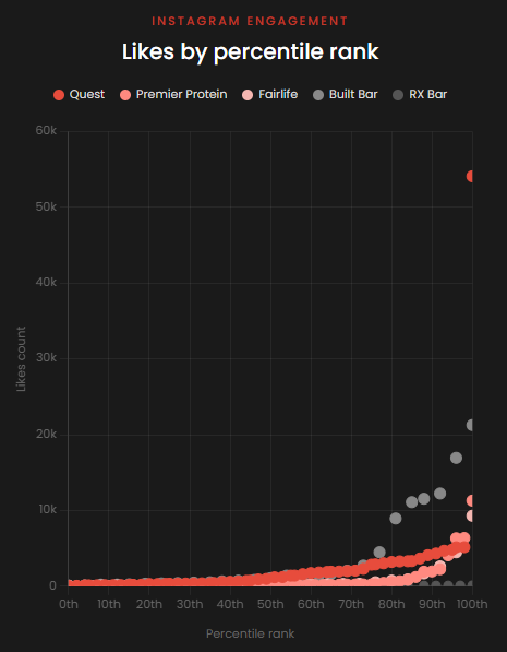
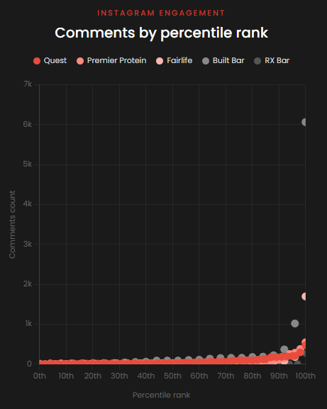
These plots rank all individual 2026 content along the x-axis to provide a clearer view of the performance distribution by engagement type. They also help identify high-performing “viral” posts, which are common across all social platforms. These plots are generally well-suited for Instagram content, given the platform's performance ceiling.
In terms of likes, Premier Protein stood out, with multiple posts appearing in the highest percentile across all brands. Although boosting was very likely an integrated strategy for some of this content across CPG brands, this channel smartly leveraged pinning as a way to amplify their post likes and essentially extend the engagement shelf life beyond the standard weeks.
In terms of comments, Built Bar was a significant player in this category. The brand featured multiple posts in 2026 that exceeded four-digit comment totals, solidifying its position as the top CPG protein brand for sparking conversation. An evaluation of these high-engagement posts reveals a consistent giveaway strategy, utilizing clear CTAs that encourage the audience to follow, like, save, and tag others. Additionally, leveraging Instagram’s collaboration feature proved highly effective, as it immediately expanded reach by appearing across multiple user feeds simultaneously.
Quest Nutrition was a consistent player in both categories, which credits their consistent content strategy, which is often required for their larger audience base.
Which CPG Protein Brand Wins on TikTok?
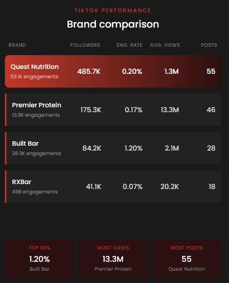
Of the five CPG protein brands analyzed on Instagram, four are also publicly active on TikTok. Fortunately, TikTok provides more granular public data—including views, likes, comments, and saves—which offers additional dimensions for our analysis. We swapped to our TikTok lenses and produced the following table:
Data Annotations:
- We collected content from each channel, specifically from 2026, with a cutoff at 3/27.
- All publicly available video metrics were used regardless of organic or paid content.
- We used only publicly available data.
Our Analysis
Similar to our Instagram analysis, Quest Nutrition stands out in this table. It leads the way in scale, boasting a significantly larger follower base, higher total engagement, and greater posting frequency.
However, regarding standardized metrics such as average engagement per video and engagement rate, Built Bar delivered solid results relative to the four brands. As noted in our Instagram analysis, this brand punches above its weight in average performance, a success we attribute to several of its strategic social media tactics on that platform. On TikTok, Built Bar delivered the highest engagement rate per follower, engagements per video, and total comments, despite ranking third in both total followers, viewership, and posting frequency.
To better understand each brand's engagement spread, we created supplementary visualizations that offer a more granular view of the data:
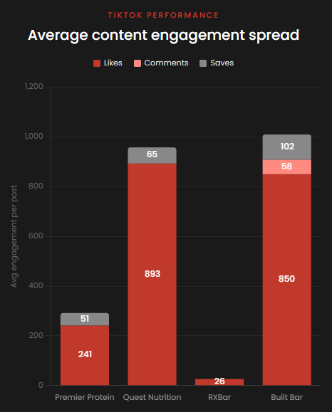
Stacked bar charts are particularly useful in social media analysis due to their compositional nature. This chart displays average engagement types per post, which allows for a more effective comparative analysis.
We can see that on a per-post basis, Built Bar holds up pretty well against Quest Nutrition. We can also see some separation in secondary engagements, such as Comments and Saves, which are generally higher-weighted engagements. Video viewership tells the larger story in this comparison, as Built Bar raked in about 10 million fewer views than Quest Nutrition, making the engagement performance much more impressive.
Conclusion: Which CPG Protein Brand Wins?
While Quest Nutrition led on both platforms in terms of follower base and sheer volume, content performance remained competitive across all CPG protein brands — Built Bar being a great example. Based on our observations, here are several key takeaways for the industry:
- What you post matters significantly more than how often you post.
- TikTok shows less follower-first activity compared to Instagram, but both algorithms better serve content significantly based on interest signals.
- Collaborations and mentions are excellent leverage plays for the industry on both platforms.
- Giveaways and promos spark excellent secondary engagements (comments and saves).
- Protein prioritization has shown year-over-year audience interest in the space, particularly due to increased mainstream GLP-1 context.
As the protein sector continues to evolve alongside shifting health trends like GLP-1 adoption, leveraging these strategic engagement levers will be essential for maintaining a competitive edge on both Instagram and TikTok.
Your brand could be in this analysis next year. The question is whether you'll be the one setting the benchmark or scrambling to catch up.
That RANDOM Agency works with CPG brands to build social media strategies that drive real performance. If you're ready to start growing, let's talk.
Contact us to start the conversation.