Random Labs: Are Instagram Reels or Carousels Better for Reach?
As we reach the midpoint of 2025, Instagram remains a leading platform in social media marketing, particularly for experimenting with high-performing content formats. This makes it an ideal time to explore two of the most effective content types based on recent performance trends: Reels and carousels. Are Reels or carousels better for reach?
Once again, we’re using our own Instagram data to inform these comparisons, specifically content from this year to date, during which we posted a high volume of carousels and Reels.
For more insights like these, feel free to follow us on Instagram!
Data Analysis:
We analyzed over 25 posts for each content type, covering approximately six months of Instagram activity. Our working hypothesis for our 2025 Instagram strategy is that Reels tend to reach significantly more users, while carousels consistently emerge as the top-performing format for driving engagement.
We’ve also observed that this performance gap between the two content types has become increasingly pronounced in recent years.
The table below compares these formats across key Instagram metrics by averages, all of which can be accessed directly from Meta Business Suite. (Check out our blog on benchmarking to learn how to pull and interpret this data.)
Additionally, if a significant difference was observed for any given metric, the corresponding cell is highlighted in green in varying shades based on that level of significance.
Having run some basic hypothesis tests comparing two samples, we can draw the following conclusions and interpretations for each metric.
Reach
Reach, alongside Engagement Rate, was the most significantly different metric among those analyzed. In addition to Reels generating higher average reach across the sample, we also observed a greater number of outliers, unlike carousels, which featured none. The data provides strong evidence—both in this analysis and from previous years—that Reels consistently offer greater audience reach potential.
Engagement
When it comes to total engagement and likes, carousels continue to lead the platform. However, the gap between carousels and Reels is narrowing in newer data—Reels are even outperforming in certain areas, such as shares and saves. Beyond the ongoing platform shift toward prioritizing video content, the recent introduction of collaboration features is likely further amplifying engagement totals for Reels. Furthermore, because Reels are outpacing all other content types in terms of reach, we expect engagement rates to be lower—though relative engagement can still be higher.
Should I Post Carousels or Reels?
So what content type should you prioritize?
Based on our analysis, Reels generate significantly higher reach than other content types. This is likely driven by the platform’s structure and the overwhelming popularity of vertical video content today.
Whether to use Reels over carousels depends on your specific strategy. We always prioritize testing different content types across various components and would never recommend narrowing your approach to a single format—social media platforms evolve faster than benchmarking reports can keep up.
Want personalized help with benchmarking strategies to optimize your social media results? Chat with our team today!
Here Are the 2025 Instagram Benchmarks by Industry
A lot has changed for Instagram over the past few years, but the platform remains one of the top powerhouses among social media platforms in 2025. We thought this would be the perfect opportunity to evaluate the 2025 Instagram benchmarks—our very first iteration on this platform.
Once again, Rival IQ released its yearly study of key social media benchmarks for 2025, including Instagram. In this post, we will:
Provide a clearer understanding of benchmarking
Analyze the Rival IQ report to assess Instagram’s performance across different industries
Define key metrics
Implement our take and summary on these metrics
What is Social Media Benchmarking?
Benchmarking is a key part of the analytics process, allowing you to compare your social media results against specific thresholds or standards. This enables you to set realistic objectives, optimize strategy, and identify what's best for your business.
The Rival IQ report focuses on metrics relative to industry benchmarks. However, you can also create your own benchmarks for a more tailored understanding of your marketing performance. Learn more from our experts about personalized benchmarking!
Also, feel free to check out the TikTok benchmarks if you're extra curious!
What are the 2025 Instagram Benchmarks?
Similar to most benchmarking studies, we examine engagement rates. Below are the corresponding rates across different industries:
Alcohol: 0.37%
Fashion: 0.15%
Financial Services: 0.26%
Food & Beverage: 0.40%
Health & Beauty: 0.14%
Higher Ed: 2.10%
Home Decor: 0.14%
Influencers: 0.58%
Media: 0.44%
Nonprofits: 0.56%
Retail: 0.16%
Sports Teams: 1.30%
Tech & Software: 0.33%
Travel: 0.34%
The overall median across all industries is marked at 0.36% for 2025.
There are two primary ways to calculate engagement rates on Instagram, which are often the two formats you'll commonly see. The list above uses Average Engagement Rate Per Post (by follower), which is likely calculated by taking the total engagement on your content, dividing it by the number of posts, and then dividing that result by the number of followers.
You can also calculate Average Engagement Rate Per Post (by reach), which we often like to do. This is calculated using post reach instead of followers, and aligns more closely with Meta’s native way of calculating engagement rates on the backend and better accounts for engagement from both non-followers and followers.
What do the 2025 Instagram benchmarks reveal?
According to Rival IQ, engagement rates across all the listed industries declined compared to the previous year. However, this doesn't necessarily mean that total engagements on the platform are down, as a decrease in engagement rate can also result from an increase in audience size — a simple example of the denominator effect.
We do have a one-word answer when it comes to content type: reels. While Reels generate strong engagement, their reach—particularly among non-followers—far exceeds their engagement levels, making them a powerfultool for visibility anddiscovery rather than pure interaction. In our observations, we notice frequent discrepancies in the number of users who get shown reels compared to other content types on Instagram. In 2025, the platform continued refining its focus on video content.
We can also notice that Higher Ed and Sports Teams are the only industries marked by Rival IQ to exceed a full percentage point in engagement rate. For sports teams, fan loyalty and passion drive high interaction—supporters celebrate wins, rally through losses, and share memorable moments, creating a vibrant and engaged fan base. Similarly, higher education institutions foster pride and belonging among students, alumni, and staff. The “alma mater” connection encourages users to engage with content that reflects shared experiences, milestones, and traditions, making these communities highly active and engaged on social media. There is some integration of one of these industries towards the other.
To conclude, looking beyond these average metrics across industries is essential. As mentioned, this includes factors such as content type, tendencies on the platform, varying audience sizes, posting cadence, and much more.
Want personalized help with benchmarking strategies to optimize your social media results? Chat with our team today!
Here Are the 2025 TikTok Benchmarks
It’s no secret that TikTok has been at the center of a political storm in 2025, facing waves of government bans and mounting pressure like never before. Regardless, we are here to help weather the storm and provide you with some benchmarks for the new year.
Once again, Rival IQ released its yearly iteration of key social media benchmarks for 2025, including TikTok. In this post, we will:
Evaluate and define key metrics
Provide a clearer understanding of benchmarking
Analyze the Rival IQ report to assess TikTok's performance across different industries
What is Social Media Benchmarking?
Benchmarking is a key part of the analytics process, allowing you to compare your social media results against specific thresholds or standards. This allows you to set realistic objectives, optimize strategy, and identify what's best for your business.
The Rival IQ report focuses on metrics relative to industry benchmarks. However, you can also create your own benchmarks for a more tailored understanding of your marketing performance. Learn more from our experts about personalized benchmarking!
What are the 2025 TikTok Benchmarks?
Much like last year’s benchmarks, we have a new set of engagement rates across various industries for TikTok.
Alcohol: 1.76%
Fashion: 0.95%
Financial Services: 1.33%
Food & Beverage: 2.04%
Health & Beauty: 0.85%
Higher Ed: 7.36%
Home Decor: 1.52%
Influencers: 1.11%
Media: 1.34%
Nonprofits: 3.04%
Retail: 1.28%
Sports Teams: 2.68%
Tech & Software: 1.21%
Travel: 2.73%
The overall median across all industries is marked at 1.73% for 2025.
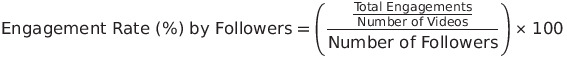
As another refresher, these figures represent the engagement rate per video relative to followers. You can calculate this for your account by summing all engagements (likes, comments, shares, etc.), dividing that by the total number of videos, then dividing the result by your total number of followers, and finally multiplying by 100 to express it as a percentage. You can use the following expression to get the engagement rate by followers for any platform:
What Do the 2025 TikTok Benchmarks Mean?
According to Rival IQ’s report, TikTok’s overall engagement rate has declined compared to the previous year. When considering this form of engagement rate, which accounts for both posting cadence and follower count, these changes can be directly influenced by shifts in either volume. It's much more challenging to maintain high engagement rates with an increase in cadence or a significantly larger audience pool. General platform turbulence may have also played a role, especially with all the shutdown news during this reporting year.
As an additional reminder, engagement rate medians and averages can be somewhat volatile in comparison contexts due to factors mentioned above—such as differences in posting activity and audience size across accounts. It’s best to approach industry comparisons from a broader, high-level perspective and consider additional benchmarking that incorporates your own data.
Want personalized help with benchmarking strategies to optimize your social media results? Chat with our team today!
Here's How to Create Your Brand's Own Social Media Benchmarks
We’ve heard it before: What is the average engagement rate for our industry? What is the optimal follower growth per month? Is our content clickthrough rate high enough? What is a good salt ratio for per pound of french fries?
Okay, maybe not that last one, but a majority of these questions are simply addressed through social media benchmarking.
What is Social Media Benchmarking?
Social media benchmarking evaluates your current social media performance relative to industry standards, competitors, or even your own historical performance.
Most major social media platforms have a wealth of data available for you, which allows you to take a look at your content at more than surface level.
You may be wondering: why go through all the trouble of benchmarking your own social media data when industry averages are just a Google search—or even a ChatGPT prompt—away? The simple overarching answer lies in the fact that social media is a highly dynamic space, making it extremely rare to find a single optimal estimate for most metrics tailored to your specific profile.
How Social Media Benchmarks Are Calculated
Lets take a popular and frequently benchmarked metric for example: engagement rates. Engagement rates represent the overall percentage of engagements on your social media content in relation to your audience. Countless studies on this percentage for various industries are scattered across the internet, but many users may not realize that there is no single, uniform method for calculating engagement rates.
Here’s some of the ways we have seen this metric be formulated:
Average engagement relative to total followers (likely the most common).
Average engagement relative to total posts - which could then be divided by total followers.
Average engagement relative to total channel impressions (with or without dividing by total posts).
Average engagement relative to total post impressions (with or without dividing by total posts).
Oftentimes, studies won’t disclose the exact formula for the metrics in question. To use a statistical term, there is a significant risk of heterogeneous measurement—where metrics are not standardized across studies. If one study uses an engagement rate formula that differs from the one you use, it can lead to inconsistencies and improper benchmarking.
Beyond measurement inconsistencies, another limitation of generalized benchmarking is that industry averages are, after all, just that—averages. More often than not, they fail to account for other dependent variables, such as the follower count of analyzed profiles, the total number of accounts included, post volume, content distribution, and more. Combined with the potential opacity of the calculations themselves, this can create further comparative issues. Therefore, it is best to use industry benchmarks as an extremely high-level overview of your performance and focus on developing your own personalized benchmarks.
Steps to Create Your Own Social Media Benchmarks
Today, we are going to take a dive into how you can benchmark your own data using some simple methods, all without needing to rely on third-party tools or breaking the bank.
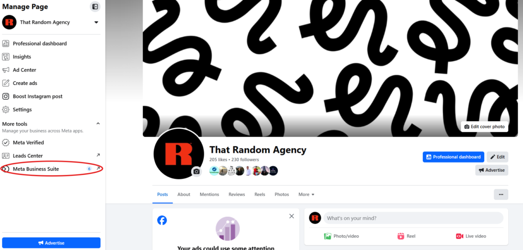
We’ll use Meta Business Suite as our example.
Meta Business Suite is a free platform that allows businesses to manage their Facebook and Instagram profiles. It provides extensive access to your channel's analytics, which can be used for benchmarking. You will need a Facebook page in order to access this.
Let’s continue with the topic of engagement rates in our example and create personalized benchmarks. We’ll need data on our content to follow this process.
1.) Locate ‘Meta Business Suite’ on the left panel once you are accessing your page.
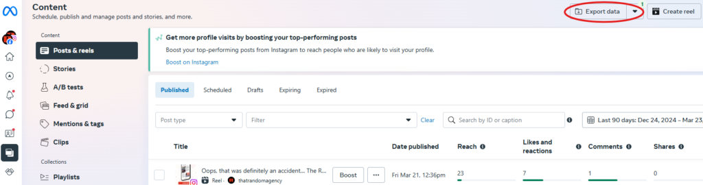
2.) In another left panel once in Meta Business Suite, look for the ‘Content’ option.
3.) Once in the Content page, you should see an option towards the top right to export performance data on your page’s Meta posts. Use this to export data on either Facebook or Instagram content through a set date range.
From this point, you need to do some spreadsheet work to formulate some content benchmarks for our channel. There are potentially hundreds and thousands of ways you can explore this dataset for benchmarking purposes.
For engagement rates, Random typically uses reach for Facebook or Instagram. This is Meta’s native denominator for calculating the metric (feel free to use impressions if preferred). This also gives us a better understanding of how our content is resonating with engaged users, both followers and non-followers, compared to dividing by followers.
Furthermore, we utilize rolling benchmarks with a maximum of three to six months of content data, as social media platforms tend to be fluid with algorithm changes and major updates. While there's no real downside to setting your duration longer than this, we find relatively shorter durations to be pretty representative as long as posting frequency is adequate. Note: Meta Business Suite won’t let you export beyond 92 days of duration. This means you may have to aggregate multiple datasets if wanting longer durations.
Continuing with our example, let’s say you want to calculate your up-to-date content average for engagement rate. In the 'Export Data' option, you can select the platform, set the dates (we’ll use the full 92 days up until the current day), and then export the data.
Here are a few calculation examples:
Average Engagement Rate
Take the sum of the ‘Reactions, Comments and Shares’ column (if using Facebook).
Take the sum of the ‘Reach’ column.
Take the output of Step 1 and divide it by the output of Step 2.
What you have now is your channel’s up-to-date average engagement rate for the past three months of content. You can compare this to the next three months of content, the same three-month period from the previous or next year, or update the value with newer months. The method for benchmarking this average is entirely flexible.
Median Engagement Rate
Within the same dataset, create a new column for engagement rates.
Set a formula that divides the engagement totals of that row’s content by the reach of the same content. If you want to include clicks in your engagement totals, you can add them to the engagement and then divide the result by reach.
If you're using Excel, move your pointer to the bottom-right corner of the cell and double-click when the black plus symbol appears to apply it to the entire column. You can also drag and drop the cell vertically.
On an empty cell, output the median of this new column of engagement rates. You can use this formula template: ‘=MEDIAN(COLUMN LETTER:COLUMN LETTER)’.
Calculating the median is an excellent way to benchmark your content engagement rate. Medians are naturally more resistant to outliers, which are common in social media analytics—such as viral videos, content types, etc. Although the exact formula for engagement rates is often difficult to discern in any particular study, most will utilize either averages or medians. We recommend comparing the median engagement rate to your individual content as this is likely a better representation of typical performance.
Why You Should Create Your Own Social Media Benchmarks
As we have shown, there are numerous ways to approach benchmarking. These include followers, clicks, click-through rates, video metrics, and more.
However, there are many considerable benefits to benchmarking your own performance:
Increased relevance to your specific audience.
Personal benchmarks are focused on your unique content strategy, tone, and visual style. Industry averages may include data from brands with different goals, making their averages less applicable to your content.
You get greater control over your data interpretation - such as alleviating the issue we mentioned before with heterogeneous measurement when comparing to industry studies.
Helps set realistic and achievable goals for your strategy.
Potential minimized impact of outliers.
Want personalized help with benchmarking strategies to optimize your social media results? Chat with our team today!
Random Labs: The Performance Impact of Blogs for Websites
We’re kicking off our first quarterly Random Labs experiment of 2025! Before diving in, you might be wondering, “What is Random Labs?” The answer is simple: Random Labs is a quarterly blog series where our team of marketers and data scientists put a theory to the test to either myth-bust or prove a marketing-related hypothesis. For Q1, 2025, here’s what we tested: What’s the performance impact of blogs on websites?
You’ve probably heard it a million times: “Blogs are essential to boost SEO and your website performance!” But what impact do they actually have? We tested this hypothesis through a more extensive lens and implemented robust data analysis.
We Tested How Blogs Affect Website Performance
For this experiment, we gathered blog data from early 2024 to early March 2025, tracking the total number of blogs and selecting dependent variables related to website performance. Dependent variables are the factors we are measuring to assess how blog presence influences website performance.
Dependent Variables:
New Users: The number of people who have never visited your website before the set date range.
Sessions: A session starts when a user views a page on the website, and it continues until there is no activity for 30 minutes or until the page closes.
Bounce Rate: The percentage of visitors who leave your website after viewing one page.
New users and sessions are both crucial metrics for analyzing overall website traffic. The gap between sessions and new users can provide insight into how often users return to the site. Additionally, bounce rate helps assess user engagement, though its significance depends on the context. In many cases, a lower bounce rate is preferable.
In this analysis, we will break down higher-level variables, such as total blog quantity, and then drill down into specific blog categories and topics to assess their impact on website performance.
Step 1: Impact of Total Blogs and Cadence
We begin with a high-level correlation check between the total number of blogs and the dependent variables. While we do not expect a strictly linear relationship between blog quantity and traffic—given the influence of other marketing tactics such as organic media, paid media, and referrals—blog content can still indirectly support these channels over time. This check provides a broad understanding of overarching trends before we narrow our focus to more precise insights in the next steps.
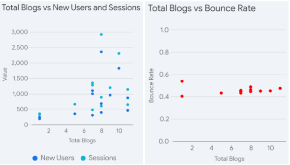
We construct the following scatterplots:
Scatterplots are excellent visualizations for analyzing relationships between independent and dependent variables. Our output shows an increasing trend in new users and sessions as the total number of monthly blogs increases, with greater dispersion in values.
The variance in bounce rates appears to decrease when the monthly blog cadence reaches approximately 8–10 blogs per month.
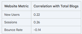
We can further supplement our scatterplots by constructing a correlation matrix, which provides more of a numerical perspective of the relationships between these variables.
Reading a correlation matrix is quite simple in this example. The numbers listed in the table represent what is known as a correlation coefficient. This is a number between -1 and 1 that measures the strength and direction of the linear relationship between two variables. In practice, it is rare to see a value of exactly -1 or 1, as these represent perfect negative or positive correlations, which are uncommon in real-world data. The closer these coefficients are to those endpoints, the stronger the linear relationship we can conclude between those variables.
Insights:
The outcome suggests a weak positive correlation between the total number of monthly blogs and the resulting new users and sessions.
Additionally, a weaker negative correlation exists between the total number of monthly blogs and website bounce rates.
This aligns with what we see in practice, as blog content is only one of many channels that drive traffic to a website—others include organic and paid social, referrals, links, search, and more. While we see some mild signs of increased website traffic alongside a potential decrease in bounce rates, more content may not always be the answer, as our upcoming findings will suggest.
Step 2: Impact of Different Blog Topics
Due to the nature and purpose of blogs, which cover a wide range of topics, our next analysis can focus on specific blog topics. The following categories were used on the same dataset to organize the large number of blog posts:
Employee Advocacy
Strategy and Guides
Social News
Trends or Memes
Analytics or Case Studies
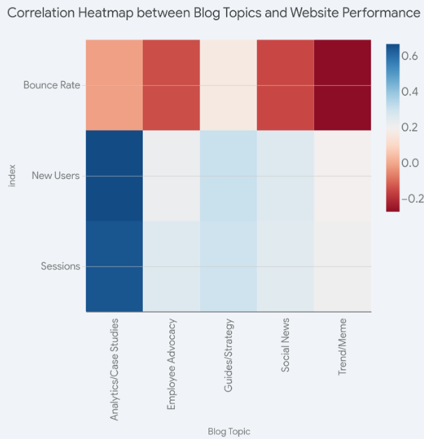
Considering the significant amount of topics we are utilizing compared to our previous step, we can use a different visualization to analyze the performance between these blog topics in relation to website performance. A correlation heatmap can be a great visual tool for this example:
The interpretation of this chart is similar to that of the correlation matrix, with the key difference being the use of color shading instead of coefficients, along with an expanded set of independent variables in the blog topics. In our example, a darker shade of blue or red indicates that a variable's correlation coefficient is closer to -1 or 1. Conversely, a lighter shade signifies a weaker linear relationship between those variables. The bounce rate is represented by a separate color scheme, reflecting its decline as blog activity and other optimizations increased over the months.
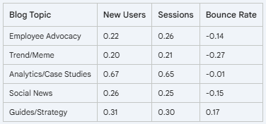
Much like our previous step, we can also supplement with a correlation matrix:
Based on the output of both charts, we can create some conclusions based on specific blog topics relative to the website performance metrics:
Insight:
Blog content related to Analytics or Case Studies showed a relatively strong positive linear relationship with an increase in new website users and sessions.
Summary: Blogs on this topic include social media benchmarking, various tests, and case studies on well-known, high-interest questions, which could explain the relatively higher search intent. Additionally, we have observed a growing share of traffic coming from AI over the year (with ChatGPT being a prime example), and this channel has been notably more consistent for blogs related to benchmarks. The general query for AI users for finding benchmarks may be higher in volume than other topics, which may have more varying topics.
Insight:
Blog content related to Trends or Memes showed a slight negative linear relationship with website bounce rates. However, this relationship was the strongest among all topics.
Summary: Trends and memes are often highly engaging visually and in terms of topic, which may influence readers to stay on the page. Additionally, blogs discussing trends or memes usually link to related posts, videos, or explanations, naturally encouraging visitors to click through rather than bounce. Current events and cultural moments may also attract users with a naturally higher level of interest.
As an additional point, the results here do not suggest a lack of relevance for the other blog topics. As mentioned before, numerous influences affect the website side of things. For example, although employee advocacy blogs don’t stand out in terms of the most substantial linear relationship with website traffic, they are often our highest-performing content on social media.
Additionally, blogs on Guides and Strategies represent our densest volume in total blog posts and likely cover the most variance of topics. This explains why it may contribute to higher bounce rates overall. A fully layered evaluation is critical for analyzing the overall effectiveness of your blog posts.
Step 3: Specific Blogs That Stand Out
We can further narrow our focus on blog content by evaluating the specific blogs that stood out regarding website performance. Here are some of the top Random content for the year!
The blog directly addresses a topic of massive interest: pop culture. This naturally attracts a large audience, as people are drawn to discussions about movies, music, events, and trends. Additionally, pages with embedded videos have the potential to rank for more keywords and achieve higher average positions on Google’s SERPs. Overall, this blog ranked highest for us in terms of both the total volume of new users and sessions, which is quite impressive considering its recent publication.
As we’ve observed in our previous steps for analyzing blog topics, “benchmarking” is likely a strong keyword for SEO, especially in the marketing and social media niches. While “benchmarking” itself is broad, long-tail variants (e.g., “Here Are the Latest TikTok Benchmarks for 2024”) attract more targeted traffic with less competition. Upon consistently evaluating blogs related to these topics, we’ve also noticed their high evergreen impact, as they remain among our highest-performing blogs by traffic even in 2025. Lastly, as previously mentioned, the implications of search traffic coming from AI have significantly benefited these blogs and will likely continue to enhance their performance.
Although the August 2024 iteration stood out for its overall performance in hindsight, we consistently find great success with these memes and trend recaps each month. The blog’s blend of timeliness, shareability, and utility makes it a traffic magnet. Memes will likely experience short-term traffic surges but at significantly high magnitudes, driven by the trends themselves. The August iteration's standout performance is a good example of this, as it aligned with highly popular events like “demure,” the Paris Olympics, and the summer season in general.
This blog led the way in the Guide or Strategy category of Random blog content. As with some of our other high-performing blogs, timeliness was a key factor, as this post was published in anticipation of National Small Business Week (April 28 - May 4). Other high-performing aspects included elements common in successful blogs, such as the numbered listicle format, content that resonates well with our specific audience, and seasonality.
Do Blogs Impact Website Performance?
To conclude our first quarterly Random Labs experiment of 2025, blog content can be an effective tactic for potentially elevating overall website performance.
While the overall cadence of blogs may not strongly correlate with an increase in total website traffic or changes in bounce rates, factors such as timeliness, shareability, and relevance can significantly impact performance on an individual case-by-case basis.
As we have frequently observed with their evergreen success, tailoring and evaluating blogs across all facets—such as social media engagement, audience relevance, and content quality—are essential for long-term success. Focusing solely on increasing website traffic can overlook the importance of creating meaningful, shareable content that resonates with readers and enhances overall brand presence.
Looking to elevate your digital marketing and SEO game? Chat with our team today!
Random Labs: Do Trending Sounds Impact Instagram Reel Performance?
In this month’s iteration of Random Labs, we continue exploring all aspects of Instagram. After evaluating SEO implications, geotagging, and more (check out our previous blogs here), we now analyze the potential impact of audio on Instagram content performance.
Specifically, do reels with an original audio experience impact performance changes compared to reels that utilize Instagram’s native music features?
The focus of this experiment will be reels, as video content has seen a definitive rise on the platform over the years—almost to the point where Instagram is transforming into a video-dominant platform.
How We Tested Trending Sounds on Instagram
The way we will separate our comparative data among Instagram reels will include one basic factor. Under the profile portion of a posted reel, there is currently a label that indicates the audio being used for the content. We want to compare reels that are labeled with “Original Audio” vs. those with named music. Here are the key differences:
Original Audio: Indicates that the audio used in the video is not sourced from Instagram's music library or any added music features. Instead, it means that the sound comes directly from the original video file, which can include voiceovers, sound effects, and other innate sound features.
Overlaid Music: When an Instagram Reel uses named music instead of “Original Audio,” it means the creator has selected a track from Instagram’s music library or a trending sound.
Once again, we will evaluate our own content here at Random! The following are some examples from a couple reels that quickly helps you identify each type.
When it comes to hypotheses, it’s safe to say that no definitive claim has been made regarding whether original reel audio or native named music performs better on Instagram Reels. There have been arguments in favor of both, with some suggesting one leads to higher engagement and reach. This underscores the importance of analyzing your own content, which we routinely do at Random.
Our Analysis of Instagram Reel Sounds
This test comparing both types of reels is relatively simple and not overly demanding in terms of statistical methodology. We begin by organizing our dataset, which includes only reels from the last six months. Next, we create a binary outcome variable to indicate whether a reel contains original audio or named music. Finally, we conduct two separate t-tests to analyze differences in reach and engagement.
A t-test is a statistical tool that helps us determine if there's a meaningful difference between two groups. Imagine you're comparing two groups of people - let's say men and women - to see if there's a real difference in their average height. A t-test is like a mathematical referee that decides whether the difference you observe is significant or just a result of random chance. So in our example, we are going to see if the difference in either engagement or reach for both types of reels contains a significant difference.
We can formulate the following table of p-values after conducting our t-tests:
Engagement
Reach
Reels w/ Original Audio
8.00
142.87
Reels w/ Named Music
10.08
149.67
p-value
0.1449 <0.05
0.8681 < 0.05
Conclusion
No significant difference
No significant difference
We once again tested at a confidence level (α) of 0.05, meaning the statistical test would be significant if falling under this threshold. This value is set to determine a tolerance for meaningful results (see our previous blog on Instagram Geotagging for a quick and free statistics lesson and application).
Conclusion: What Type of Instagram Sound Should You Use?
Based on our results, there were no statistically significant differences (at a 95% confidence level) between reels with original audio vs. named music in their effects on engagement or reach. This means, we did not find any significant impact on post performance when using one type of audio over the other for Instagram reels.
This result is what we expected for this analysis, primarily because of how many other dimensions there are in evaluating reels as a content type. There are likely other aspects of a reel that contribute to post performance at a higher magnitude, such as visual appeal, captions, timeliness, and trends.
This also does not mean that using original audio or Instagram's audio has zero impact. Leverage can certainly vary based on how things align for the overall post. Brand-specific or voiceover content may find better leverage with original audio while trend-based or emotional content may very well work better with Instagram’s music. There's no one-size-fits-all approach for each individual piece of content.
Ultimately, the choice between original audio and named music should depend on the specific content and goals of each reel. Experimenting with both and analyzing performance can help determine what works best for your audience. It's important to make assessments based on evaluation that best tailors to your profile and leverage your own data.
Need data-driven solutions to grow your business with Instagram? Chat with our team today!
Random Labs: Does Instagram Caption Length Affect Performance?
As we continue navigating the turbulent social media landscape of 2025, we embark on another Random Labs experiment—this time analyzing how caption length might impact Instagram post performance.
In our previous experiment, we analyzed the impact of using hashtags versus keywords on this platform (check out this blog to see the results). We continue our statistical adventures by analyzing another component of Instagram captions–length. With growing discussions about the increasing impact of SEO on this platform over the years, this analysis will serve as a great supplement to the overall topic.
How We Tested Instagram Caption Length
To analyze the impact of caption length on Instagram post performance, we first need to manually create a variable representing the size of a post’s caption.
Instagram, through Meta Business Suite, does not include such variables in its exportable data. Instead, this data typically consists of standard social media metrics, such as engagement, reach, and more.
Fortunately, most datasets from each platform almost always include a column listing the caption associated with each post. With a little spreadsheet magic, we can create a new column that counts the character length of the caption and add it into our statistical model.
We will be conducting this experiment with some statistical modeling, specifically a Multiple Linear Regression (MLR) model.
A simple example for this methodology would be: imagine you're trying to guess the price of a house. You know that bigger houses usually cost more, but that's not the only thing that matters. The neighborhood, the number of bedrooms, and how old the house is all play a role too. MLR is like a smart calculator that looks at all these factors together to make a good guess about the house price.
In our example, we are testing to see if the factor regarding caption length will statistically have an impact on content performance (engagement or reach).
In our example today, to add more context to the model, we also want to include a variable that shows whether that specific post contained a hashtag or not. This can give us more insights on whether there’s any specific sweet spots with caption length with or without hashtags.
What is the Best Length for Instagram Captions?
Here are the conclusions for both of our models:
Variable of Interest
Adjusted R-Squared
Caption Length Significant
Reach
0.0222
No
Engagement
0.0515
No
Interpretation
Today, Random Labs introduces a new statistical measurement: the Adjusted R-Squared. This metric is frequently used in MLR’s to provide a more accurate assessment of a model's predictive power than a regular R-Squared.
Let’s use another fun example to explain this value:
R-squared tells us how well all these factors together predict the test score (reach or engagement in our example). However, it always increases when we add more factors, even if they're not really helpful.
Adjusted R-squared is like a skeptical friend who says, "Hold on, are those new factors actually helping us make better predictions, or are they just making things more complicated?"
So, if adding "what the student had for breakfast" doesn't really help predict test scores, the adjusted R-squared would decrease, telling us it's probably not worth including that factor. This is key for our social media example, which innately will include various potential performance factors.
Based on our output in the study, we can see that we outputted a very low Adjusted R-Squared value for both models including caption length as a predictor for a post’s reach or engagement. The low values for both tests suggests that after accounting for all the different variables relating to a post’s caption, including caption length, they only account for 2.2% and 5.1% of post’s reach and engagement respectively.
We can confidently conclude that a post’s reach and engagement are more likely affected by other factors.
How to Optimize Your Instagram Captions
These results aren’t particularly surprising to us, as we understand the dynamic nature of social media content. A post’s performance on most platforms is ultimately difficult to predict, although we have identified significant factors in the past. Specifically, when it comes to captions, we are likely looking at the keywords themselves as more of an impactful component as opposed to the overall length of the caption: quality over quantity.
We also continue to emphasize in each of these experiments that all social media profiles are different and that drawing conclusions tailored to your profile’s needs is key.
Need a data-backed strategy to grow your business? Chat with our team today!
Random Labs: Are Keywords or Hashtags Better for Reach on Instagram?
As we turn the page into 2025, we decided it was a great opportunity to open the year with another Random Labs experiment. This time, we focused our analysis on Instagram, a rapidly changing social media platform, to understand the impact that keywords or hashtags may or may not have on Instagram reach.
Do Hashtags Actually Increase Reach on Instagram?
There have been frequent arguments throughout Instagram's lifespan associating the use of hashtags with improved post exposure. If this was true, we would expect higher reach among these posts. However, questions about the effectiveness of this conventional aspect of social media posting have been increasing in recent times.
One rebuttal involves the idea that performance relative to captions is more attributed to the keywords themselves rather than strictly to hashtags. Adam Mosseri, the CEO of Instagram, has previously commented about his platform’s changing environment to user experience and content discovery, which may have seemed like an exclusive role to hashtags in the past.
How We Tested the Effectiveness of Keywords
At Random, curiosity—one of our core values—often drives experimentation. With this in mind, we tested different caption strategies on our own Instagram content to evaluate this hypothesis. Below is an example of what the differences in captions looked like.
To maintain an adequate sample size for this hypothesis testing, we also included zero-hashtag content that did not contain additional keywords.
Performance metrics were analyzed on a per-month basis and compared with similar content types to further narrow down performance within the same time frame and context. For example, Instagram reach for reels will average significantly higher in this metric compared to single image posts so we compared reels without hashtags to reels with hashtags. There’s a lot of random (no pun intended) noise in the world of social media, so it’s essential that we fine-tune our testing.
The Results: Are Keywords or Hashtags Better for Reach?
We utilized 8 of the 12 calendar months to create individual monthly comparisons of averages between no-hashtag content and hashtag content. The content we compared them to was pulled from a random sample of similar content within the same month and cleaned of any outliers or viral content. The following table summarizes the average results for each month:
Month
Reach (No Hashtags)
Reach (Hashtags)
Difference
February
246
83
+196.4%
April
446
44
+913.6%
June
144
74
+94.6%
August
114
59
+93.2%
September
111
68
+68.2%
October
152
99
+53.5%
November
457
67
+582.1%
December
56
139
-59.7%
The table contains columns representing the months where the experiments were held, the average post reach of content with or without hashtags, and the percent difference between these averages.
Interestingly, in 7 out of the 8 months tested, we observed that content without hashtags had a higher average reach. In several of these months, the differences in averages were in the triple-digit percentage range. Surprisingly, in 6 out of those 7 months, the posts without hashtags outperformed those with hashtags in reach. They also ranked as the top-performing posts for their respective months.
What Is the Significance of Our Results?
Before drawing any definitive conclusions, we need to establish some basic statistical boundaries. The majority of the tested content consists of reels, which inherently show greater variation in reach compared to other content. Other factors likely have a greater influence, including the topic, quality, timing, and various external elements.
Additionally, this is a newer experiment, so a larger sample of posts still needs to be evaluated. However, the initial results align with the platform's general trend of decreasing reliance on hashtags.
So, how will hashtags be utilized on this platform in 2025? They will continue to serve their primary purpose of helping users manually discover content within specific categories. However, overloading posts with hashtags is unlikely to significantly impact reach and may even lead to negative returns. As we’ve often concluded in previous Random Labs sessions, every profile is unique. Be sure to base your evaluations on your own data.
Need a data-backed strategy to grow your digital results? Chat with our team today!