Random Chart of the Month - Which 2022 Vehicles had the Most CO2 Emissions?

Brandon Kim

April 2023

As we begin to close the curtains on Earth Month, this is an excellent opportunity to bring in April's iteration of Random Chart of the Month. This time, we will analyze the publicly known Fuel Economy data for vehicle manufacturers in 2022 provided by the Environmental Protection Agency (EPA).

The Data

Since the mid-1970s, the United States government has been collecting and publishing Fuel Economy data to discern the availability/cost of oil and the environmental impact on emissions. The EPA measures and tests fuel economy and emissions, which is then publicly available on their government website. 

We will be looking specifically at the 2022 iteration of the Fuel Economy data. It covers a wide range of variables for each recorded vehicle for that year, including CO2 (carbon dioxide) emissions, which we are highly interested in this analysis. We can visualize this data relating to how much vehicles emit based on various features such as brand and fuel type. We can then perform some data mining techniques to see what other vehicle components play significant roles in how much CO2 a car emits. 

The Chart

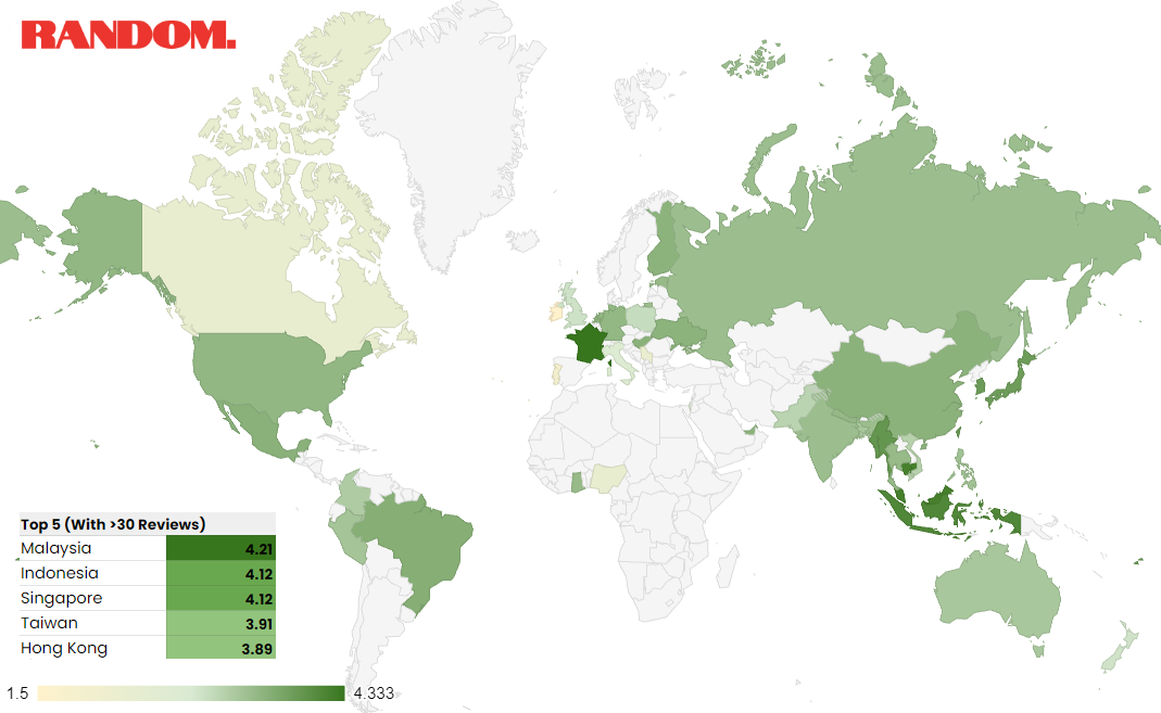
When evaluating this extensive dataset, three different variables measured CO2 emissions by each vehicle: city, highway, and combined. We also had a categorical variable naming which manufacturer belonged to that vehicle. With this information, we were able to discover, by a multiple bar chart, which manufacturer averaged the most CO2 emissions (for both city and highway): 

In 2022, Rolls-Royce averaged the highest among all manufacturers in this data based on these averages for combined CO2 emissions for both city and highway driving cycles. On the lower end, we had Mitsubishi Motors Corporation averaging the least combined CO2 emissions. 

The Analysis

Although it is fun to see how different manufacturers compare in a plot for CO2 emissions, there are further questions we can answer when we evaluate this large government data set. Now that we have a general quantification of where different manufacturers averaged CO2 emissions for their 2022 models, we can also look into other factors about those vehicles contributing to more significant emissions. 

This is where we utilized some data mining techniques to fit a statistical model, specifically a multiple linear regression. Multiple linear regression is a statistical method that models relationships between a dependent variable and two or more independent variables. It is essential throughout the entire modeling process and interpretation to understand what these variables mean: 

Tying into the Fuel Economy data, our dependent variable in question would be the combined CO2 emissions by the vehicle. We want to analyze and find out which other features in a vehicle included in the data play a statistical significance in contributing to how much a car pollutes. After meeting certain statistical assumptions for this modeling technique (we will likely cover these techniques in a future analysis blog, so stay tuned!), we can fit a multiple linear regression model to determine those predictors. 

After running this model, we concluded a handful of predictors that impact combined CO2 emissions. One significant feature in a vehicle that strongly correlated with CO2 emission was the vehicle engine's method for air aspiration. Across all vehicle brands, cars with the supercharged process for air aspiration seemed to average higher levels of combined CO2 emission. This is likely related to how this engine type requires more fuel for its combustion process, increasing the overall amount of pollutants. Turbocharged engines averaged the lowest combined CO2 emissions among the different air aspiration descriptions. 

Another significant predictor for CO2 emissions, to no one's surprise, is the vehicle's class description. This feature directly relates to the size of the vehicle, which should broadly impact mass and, ultimately, how much power is required to move the car. Among all class descriptions, vans averaged the highest combined CO2 emission, while compact cars emitted the least. 

Although we could name some significant predictors for CO2 emissions, some factors outside the Fuel Economy data can contribute to substantial emissions. Some non-recordable variables include a person's driving style, overall traffic conditions, vehicle maintenance, etc. A special shoutout to vehicles marked with the ˜electricity' fuel usage, which averaged zero CO2 emissions. #SustainabilityRocks

Continue to tune into our ˜Random Chart of the Month' each month! We're experts at analyzing all kinds of data, but especially social media. Let us help you build a social media campaign backed by data and results. Reach out to us below! 

Random Chart of the Month - Top Instant Noodles by the Ramen Expert

As we all prepare to look back on the passing colder season (or perhaps our not-too-distant college days), there's no better time to introduce our first Random Chart of the Month, featuring instant noodles! 

Specifically, we are looking to visualize and analyze a large dataset provided by The Ramen Rater, a seasoned expert who has reviewed instant noodle brands from around the world for over 20 years. His dataset, known as The Big List, contains over 4,000 entries of the instant noodles' variety, brand, style, country of origin, as well as a personal rating on a numerical scale of 0 through 5. This dataset is ongoing and continually updated, so ramen enthusiasts should go check out The Ramen Rater and all his cool content! 

The Chart

With the sheer amount of instant noodles entries alongside the categorization in the dataset, a prominent analysis question was: which countries do it better? Taking the variables on the expert rating of the instant noodles as well as their origin, we were able to generate the following geographical heat map:

This geographical chart measures, by country, the average ratings of all instant noodle brands and codes them into a color scale. The darker green signifies the higher end of the 0-5 rating scale, while the light yellow is the lower. 

The Analysis

At first glance, we can see a significant increase in the amount of countries coded with darker green when we evaluate the eastern side of the world map. It probably doesn't surprise most of us to see more of that darker green populate around Southeast Asia, as that area marks the origin of instant noodles (Japan, in 1958). 

When ranking the average ratings among countries with at least 30 reviews, instant noodles branded from Malaysia came out on top with the highest average rating of 4.21. This also aligns with a YouTube video by The Ramen Rater, where he gave a 2022 ranking of the top 10 instant noodles of all time, with Malaysian-branded instant noodles appearing five times. South Korea and Japan closely follow with 3.88 and 3.86, respectively. 

The three most prevalent countries regarding total reviews in this list were Japan, South Korea, and the United States. These three countries combined branded about half of the 4,298 instant noodle entries in this iteration of The Big List. Japan, the inventor of it all, leads all countries with the most entries with 845 instant noodle ratings. The large variability by the sheer number of instant noodles branded in Japan makes their average rating of 3.86 rather impressive. 

Knowing the powerhouse that is Southeast Asia when it comes to instant noodles, there's another analysis question we can consider: what are the best packaging types for instant noodles? 

This same dataset categorized each instant noodle with a variable relating to its packaging type, for instance, whether they came in a pack, box, bowl, etc. The three most dominant types were instant noodles packaged in packs, cups, and bowls (about 93% of all instant noodles in this list were from these categories). Averaging out the same rating scale by packaging type, instant noodles in packs average a rating of 3.82, followed by bowls at 3.69, then cups at 3.47. We also constructed a 95% confidence interval for the ratings of each packaging type to really compare the three means: 

Confidence intervals are a way to show some accuracy in our estimation. In statistics, we often use these intervals to make an educated guess about a larger population or, for relevancy, a larger population of noodles. A practical interpretation of a 95% confidence interval is: if we ask our ramen expert to rate the same number of instant noodles (falling in the Pack category) a hundred times, we expect about 95 of our average ratings to fall between 3.78 and 3.86. 

When deciding on the differences in averages with this method, we generally look for any overlaps between each interval. If such overlaps existed, we could conclude that one packaging type wasn't too significantly different from the other based on average ratings by our ramen expert. For our data, we can see averages for the packaging type of packs were slightly higher than bowls and even more so than cups. We also have a smaller margin of error for the ratings of instant noodle packs, considering almost half of the noodles populated this packaging type. 

Using our ramen expert's list, we visualized and learned of higher review ratings from Southeast Asian-brand instant noodles. We also supplemented these findings by concluding that the packaging type of packs is generally favorable among the same metric. To our delight, it is clear that the world of instant noodles is varied, and there is something for everyone on the globe to try. But hardcore instant noodle enthusiasts may consider at least trying some of those Malaysian-brand noodle packs or even seek the veteran opinions of The Ramen Rater

Continue to tune into our ˜Random Chart of the Month' each month! We're experts at analyzing all kinds of data, but especially social media. Let us help you build a social media campaign backed by data and results. Reach out to us below!